1.4 用 SwiftUI 创建 tvOS 媒体目录应用
原文链接: https://developer.apple.com/documentation/swiftui/creating-a-tvos-media-catalog-app-in-swiftui
1.4 用 SwiftUI 创建 tvOS 媒体目录应用
为你的 tvOS 应用构建标准的内容卡片和内容货架行。
概述
这个示例代码项目展示如何为 tvOS 创建标准的内容卡片,并给出构建内容货架行的最佳实践。它还包含产品页、搜索视图和标签页视图的示例,包括在 tvOS 中提供侧边栏的、新的自适应侧边栏标签页视图样式。
注意:这个示例代码项目与 WWDC24 的 10207 号场次把 TVML 应用迁移到 SwiftUI相关。
示例项目包含下列示例:
StackView 实现了内容目录应用的示例落地页,定义了若干货架,并在它们上方放置了一个展示区或主视觉页眉。它还演示了首屏内外的切换动画。ButtonsView 展示了 tvOS 中各种可用的按钮样式。DescriptionView 演示如何构建类似 Apple TV 应用中产品页的页面,并带自定义的材质模糊效果。SearchView 演示一个简单的搜索页面,使用 searchable(text:placement:prompt:) 和 searchSuggestions(_:) 修饰符。SidebarContentView 展示如何用 tvOS 18 中新的标签栏 API 制作带分区的侧边栏。HeroHeaderView 演示如何创建材质渐变,把某个区域中的内容模糊并渐变为未模糊的内容。
创建内容卡片
borderless 按钮样式提供了 tvOS 中使用的主要卡片样式,包含所有聚焦交互与悬停效果。当按钮的图片在聚焦时放大,按钮的标题以及附近的分区标题会自动让开。
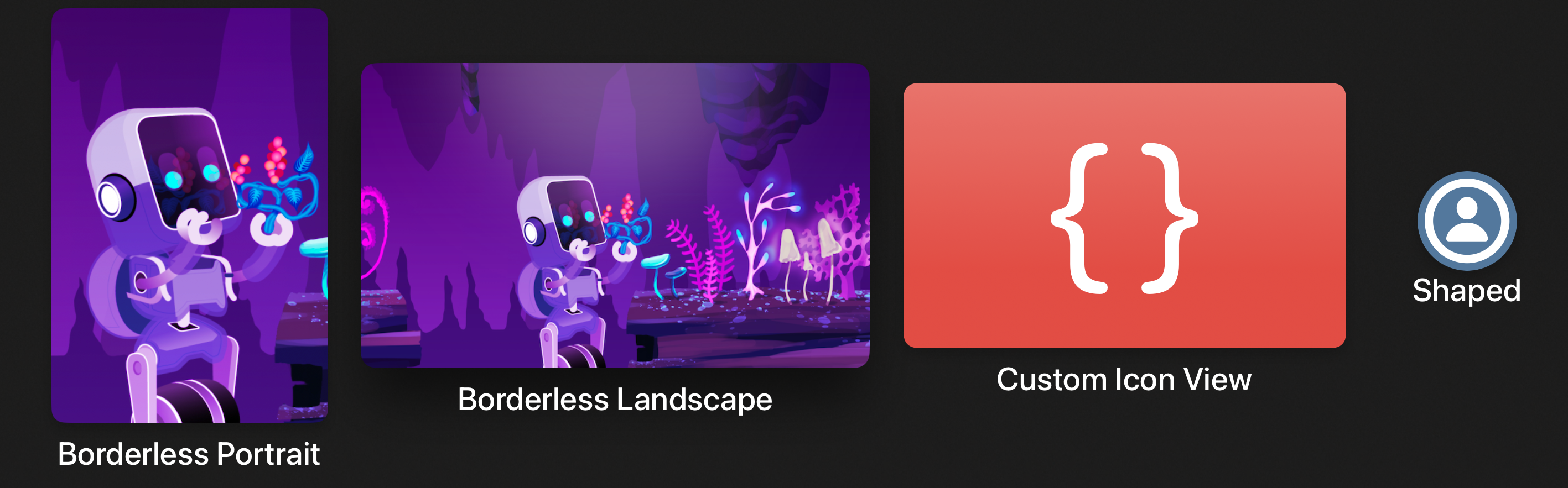
请在按钮的标签闭包中分别提供 Image 和 Text 视图,以确保纵向外观正确。使用 Label 通常会导致横向布局,并且依据当前的标签样式,可能得不到你期望的外观。
1
2
3
4
5
6
| Button { /* 动作 */ } label: {
Image("discovery_portrait")
.resizable()
.frame(width: 250, height: 375)
Text("Borderless Portrait")
}
|
默认情况下,该按钮样式会找到按钮标签中的第一个 Image,并给它附加 highlight 悬停效果,提供抬升、高光以及陀螺仪式的运动效果。
为确保悬停效果恰好应用到正确的视图上,你可以用 hoverEffect(_:) 修饰符把它手动附加到按钮标签中的某个特定子视图。例如,要让一个 SF Symbols 图像连同它的背景一起产生悬停效果,可以这样做:
1
2
3
4
5
6
7
8
| Button { /* 动作 */ } label: {
Image(systemName: "person.circle")
.font(.title)
.background(Color.blue.grayscale(0.7))
.hoverEffect(.highlight)
Text("Shaped")
}
.buttonBorderShape(.circle)
|
你也可以把悬停效果附加到自定义视图上。
1
2
3
4
5
6
| Button { /* 动作 */ } label: {
CodeSampleArtwork(size: .appIconSize)
.frame(width: 400, height: 240)
.hoverEffect(.highlight)
Text("Custom Icon View")
}
|
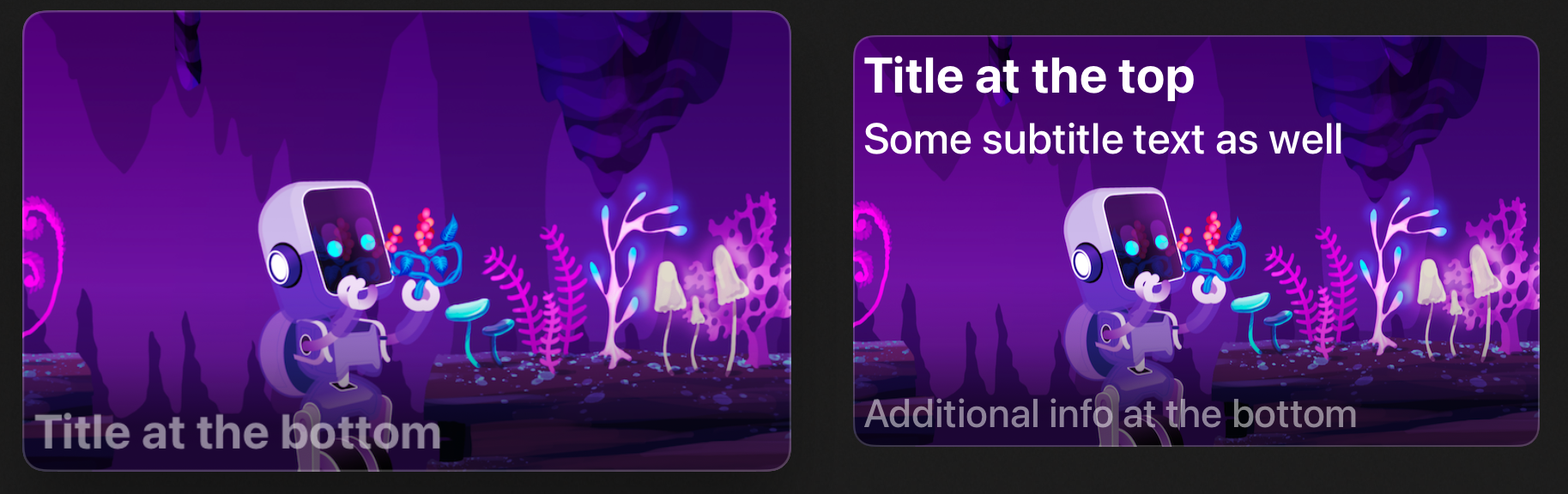
对于信息更密集的卡片,可以考虑使用 card 按钮样式,它提供一个底板,并带有更含蓄的聚焦运动效果。把带内边距的容器作为按钮标签,可以得到类似 Apple TV 应用中搜索结果卡片的效果。
 1
 2
 3
 4
 5
 6
 7
 8
 9
10
11
12
13
14
15
16
17
18
19
20
21
22
23
24
25
| Button { /* 动作 */ } label: {
HStack(alignment: .top, spacing: 10) {
Image( . . . )
.resizable()
.aspectRatio(contentMode: .fit)
.clipShape(RoundedRectangle(cornerRadius: 12))
VStack(alignment: .leading) {
Text(asset.title)
.font(.body)
Text("Subtitle text goes here, limited to two lines.")
.font(.caption2)
.foregroundStyle(.secondary)
.lineLimit(2)
Spacer(minLength: 0)
HStack(spacing: 4) {
ForEach(1..<4) { _ in
Image(systemName: "ellipsis.rectangle.fill")
}
}
.foregroundStyle(.secondary)
}
}
.padding(12)
}
|
你也可以用自定义的 LabelStyle 做出标准的卡片式外观,同时让使用处的按钮声明保持整洁。
 1
 2
 3
 4
 5
 6
 7
 8
 9
10
11
12
13
14
15
16
17
18
19
20
21
22
23
24
25
26
27
28
29
30
31
32
33
34
| struct CardOverlayLabelStyle: LabelStyle {
func makeBody(configuration: Configuration) -> some View {
ZStack(alignment: .bottomLeading) {
configuration.icon
.resizable()
.aspectRatio(400/240, contentMode: .fit)
.overlay {
LinearGradient(
stops: [
.init(color: .black.opacity(0.6), location: 0.1),
.init(color: .black.opacity(0.2), location: 0.25),
.init(color: .black.opacity(0), location: 0.4)
],
startPoint: .bottom, endPoint: .top
)
}
.overlay {
RoundedRectangle(cornerRadius: 12)
.stroke(lineWidth: 2)
.foregroundStyle(.quaternary)
}
configuration.title
.font(.caption.bold())
.foregroundStyle(.secondary)
.padding(6)
}
.frame(maxWidth: 400)
}
}
Button { /* 动作 */ } label: {
Label("Title at the bottom", image: "discovery_landscape")
}
|
显示内容货架
内容货架通常是滚动视图中的水平栈。
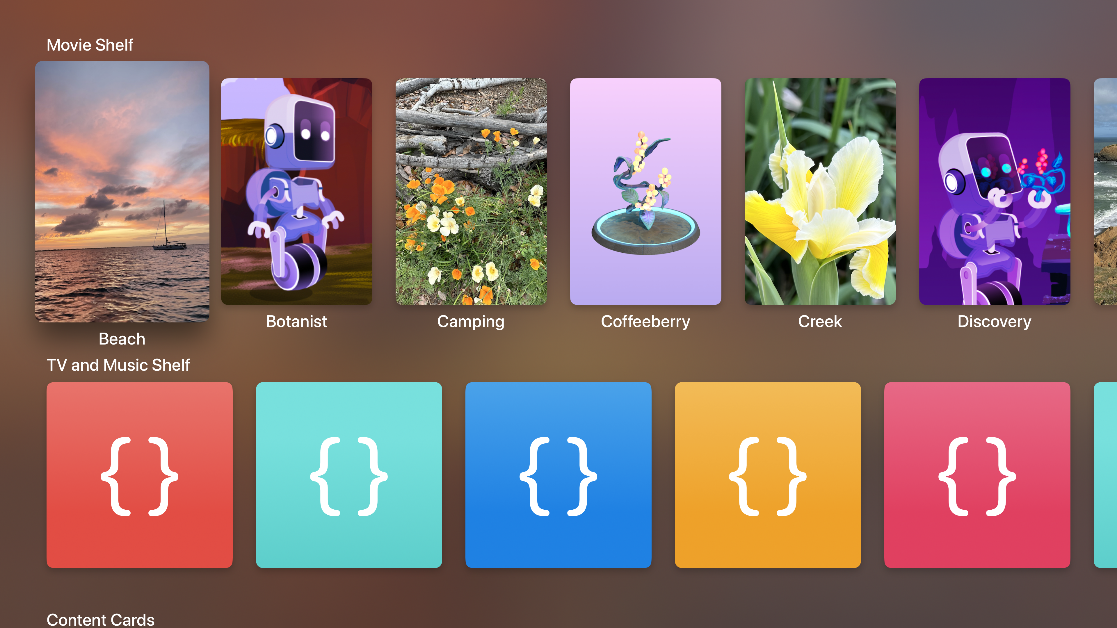
必须禁用滚动裁剪,才能让聚焦效果放大并抬起每个卡片。货架通常只包含一种卡片样式,因此请把按钮样式设置在货架容器的外层。
1
2
3
4
5
6
7
8
9
| ScrollView(.horizontal) {
LazyHStack(spacing: 40) {
ForEach(Asset.allCases) { asset in
// . . .
}
}
}
.scrollClipDisabled()
.buttonStyle(.borderless)
|
为把卡片排布得整齐美观,请使用 containerRelativeFrame(_:count:span:spacing:alignment:) 修饰符,让 SwiftUI 为每个卡片确定最合适的大小。你可以指定希望在一屏中放多少个卡片,以及栈视图提供的间距大小。随后 SwiftUI 会安排内容,使首尾两个卡片的边缘与其容器的前缘、后缘安全区域内边距对齐。
对于无边框按钮,你可以把该修饰符附加到按钮标签闭包中的 Image 实例上,让这张图片成为尺寸计算与对齐的依据。
1
2
3
4
5
| asset.portraitImage
.resizable()
.aspectRatio(250 / 375, contentMode: .fit)
.containerRelativeFrame(.horizontal, count: 6, spacing: 40)
Text(asset.title)
|
显示首屏之上与首屏之下的内容
对于落地页,你可以结合 ScrollTargetBehavior 与带渐变遮罩的背景视图,实现首屏之上和首屏之下的两种外观。
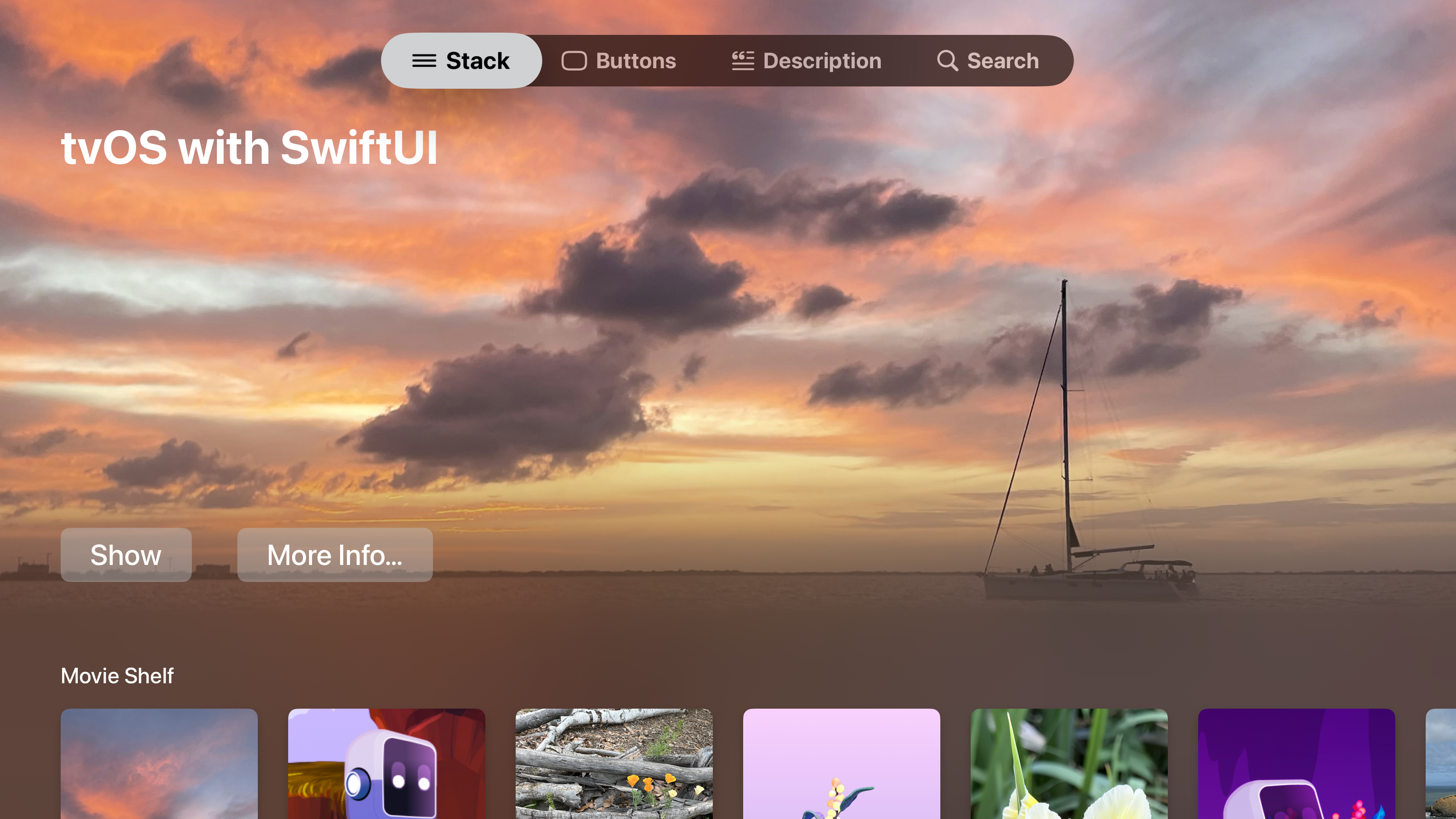
把你的展示区或页眉区定义为一个栈,并加上相对于容器的尺寸,让它在可用空间中占据特定比例。同时给这个栈附加 focusSection() 修饰符,这样它的整幅宽度都能作为焦点移动的目标,并进而把焦点转交给其中的内容。否则,从下方货架右侧向上移动焦点可能会失败,或者会直接跳到标签栏,因为焦点引擎会沿着当前聚焦项所在直线寻找最近的可聚焦视图。
1
2
3
4
5
6
7
8
| VStack(alignment: .leading) {
// 页眉内容。
}
.frame(maxWidth: .infinity, alignment: .leading)
.focusSection()
.containerRelativeFrame(.vertical, alignment: .topLeading) {
length, _ in length * 0.8
}
|
上面的代码是首屏之上的部分。要检测焦点何时移动到首屏之下,请使用 onScrollVisibilityChange(threshold:_:) 来检测页眉视图何时有一半以上移出屏幕。
1
2
3
4
5
6
7
| .onScrollVisibilityChange { visible in
// 当页眉滚动超过 50% 移出屏幕时,
// 切换到首屏之下的状态。
withAnimation {
belowFold = !visible
}
}
|
你可以用一张全屏图片加叠加层中的材质来定义落地页的背景。然后可以把它用 LinearGradient 遮罩,从而把材质变成渐变;并根据视图处于首屏之上还是之下,调整该渐变各色标的透明度。
 1
 2
 3
 4
 5
 6
 7
 8
 9
10
11
12
13
14
15
16
17
18
19
20
| Image("beach_landscape")
.resizable()
.aspectRatio(contentMode: .fill)
.overlay {
// 通过用材质填充一块区域,再用线性渐变遮罩该区域,
// 构造渐变材质。
Rectangle()
.fill(.regularMaterial)
.mask {
LinearGradient(
stops: [
.init(color: .black, location: 0.25),
.init(color: .black.opacity(belowFold ? 1 : 0.3), location: 0.375),
.init(color: .black.opacity(belowFold ? 1 : 0), location: 0.5)
],
startPoint: .bottom, endPoint: .top
)
}
}
.ignoresSafeArea()
|
通过调整渐变各色标的透明度、而不是替换遮罩视图,你可以在两种外观之间获得平滑动画:首屏之上时,材质在某个高度之上逐渐淡出、露出后面的图片;首屏之下时,整张图片都变模糊。
在折点处吸附
你可以实现一个自定义的 ScrollTargetBehavior 来做出折点吸附效果。然后加入判断,确定滚动事件的目标是否越过了折线阈值,并把该目标更新为页面顶部(向上移动时)或你的第一个内容货架顶部(向下移动时)。由于视图已经跟踪首屏之上/之下的状态,它可以把这个信息传给该行为,以指明要检查哪种操作。
 1
 2
 3
 4
 5
 6
 7
 8
 9
10
11
12
13
14
15
16
17
18
19
20
21
22
23
24
25
26
27
28
29
30
31
32
33
34
35
36
| ScrollView {
// . . .
}
.scrollTargetBehavior(
FoldSnappingScrollTargetBehavior(
aboveFold: !belowFold, showcaseHeight: showcaseHeight))
struct FoldSnappingScrollTargetBehavior: ScrollTargetBehavior {
var aboveFold: Bool
var showcaseHeight: CGFloat
func updateTarget(_ target: inout ScrollTarget, context: TargetContext) {
// 视图在首屏之上,且向下移动的距离不够,因此不做改动。
if aboveFold && target.rect.minY < showcaseHeight * 0.3 {
return
}
// 视图在首屏之下,且页眉尚未进入屏幕,因此不做改动。
if !aboveFold && target.rect.minY > showcaseHeight {
return
}
// 向上移动:要求露出页眉超过 30%,否则不允许向上滚动。
let showcaseRevealThreshold = showcaseHeight * 0.7
let snapToHideRange = showcaseRevealThreshold...showcaseHeight
if aboveFold || snapToHideRange.contains(target.rect.origin.y) {
// 吸附对齐,让第一个内容货架位于屏幕顶部。
target.rect.origin.y = showcaseHeight
}
else {
// 向上吸附,露出页眉。
target.rect.origin.y = 0
}
}
}
|
提供产品高亮页
产品页常常使用材质渐变外观,并配合首屏之上/之下的吸附。你很可能需要稍微调整渐变的参数,以适配屏幕底部更高的一栏内容;但通常你会希望保留下内容的主视觉图片(加上适当的模糊),在向下滚动时作为视图的背景。
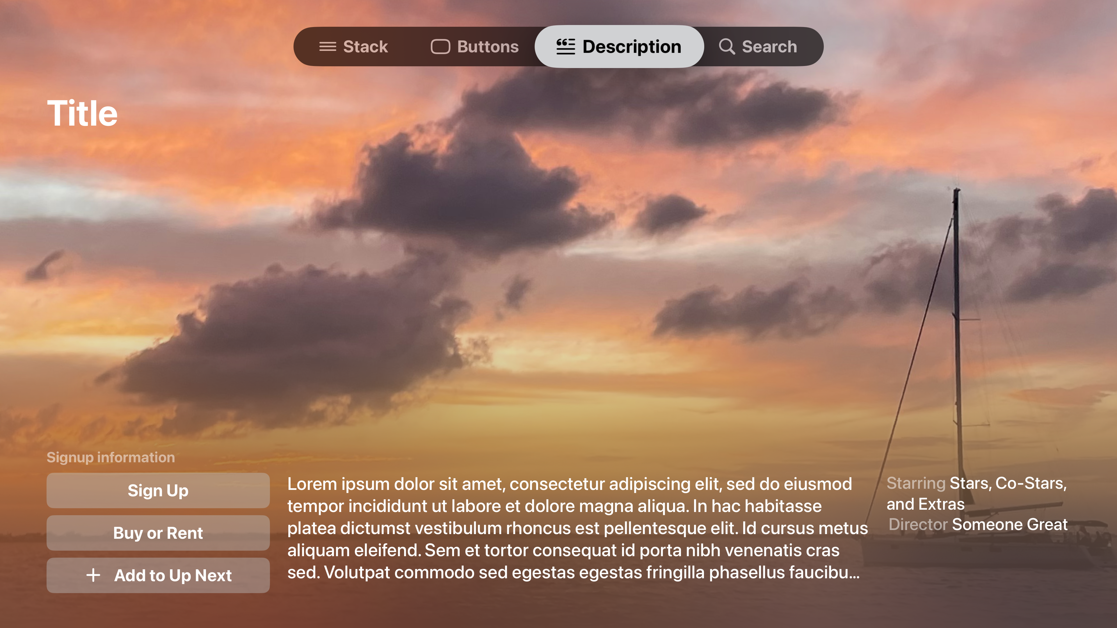
这会让每个产品的页面都独一无二,用其标志性画面为内容染色。Apple TV 主屏幕也使用同样的效果——系统会模糊最近显示过的顶架图片,并把它用作 tvOS 主屏幕的背景。
在你的描述视图中,你可能想显示一叠带边框的按钮,并让每个按钮都拉伸到相同宽度。SwiftUI 实现带边框按钮的方式是给它们的标签附加背景,因此仅仅增大按钮视图的尺寸并不一定会让背景底板变大。相反,你需要指明标签内容可以扩展,这样它的背景也会随之扩展。给按钮的标签内容附加 frame(minWidth:idealWidth:maxWidth:minHeight:idealHeight:maxHeight:alignment:) 修饰符就能做到这一点。
 1
 2
 3
 4
 5
 6
 7
 8
 9
10
11
12
13
14
15
16
17
18
19
| VStack(spacing: 12) {
Button { /* 动作 */ } label: {
Text("Sign Up")
.font(.body.bold())
.frame(maxWidth: .infinity)
}
Button { /* 动作 */ } label: {
Text("Buy or Rent")
.font(.body.bold())
.frame(maxWidth: .infinity)
}
Button { /* 动作 */ } label: {
Label("Add to Up Next", systemImage: "plus")
.font(.body.bold())
.frame(maxWidth: .infinity)
}
}
|
显示内容描述时,可以让它在页面上截断,并把它放进使用 .plain 样式的 Button 中。这样人们就能选中它,而你可以用 fullScreenCover(isPresented:onDismiss:content:) 修饰符附加的叠加视图来呈现完整描述。
1
2
3
4
5
6
| .fullScreenCover(isPresented: $showDescription) {
VStack(alignment: .center) {
Text(loremIpsum)
.frame(maxWidth: 600)
}
}
|
搜索内容
对于搜索页面,建议使用 LazyVGrid 容纳搜索结果,并让卡片本身采用横向布局。这样一屏能显示更多内容,可以有三到五行、每行三到五个条目。较高的内容容器区域让你更容易看出搜索词变化带来的效果。
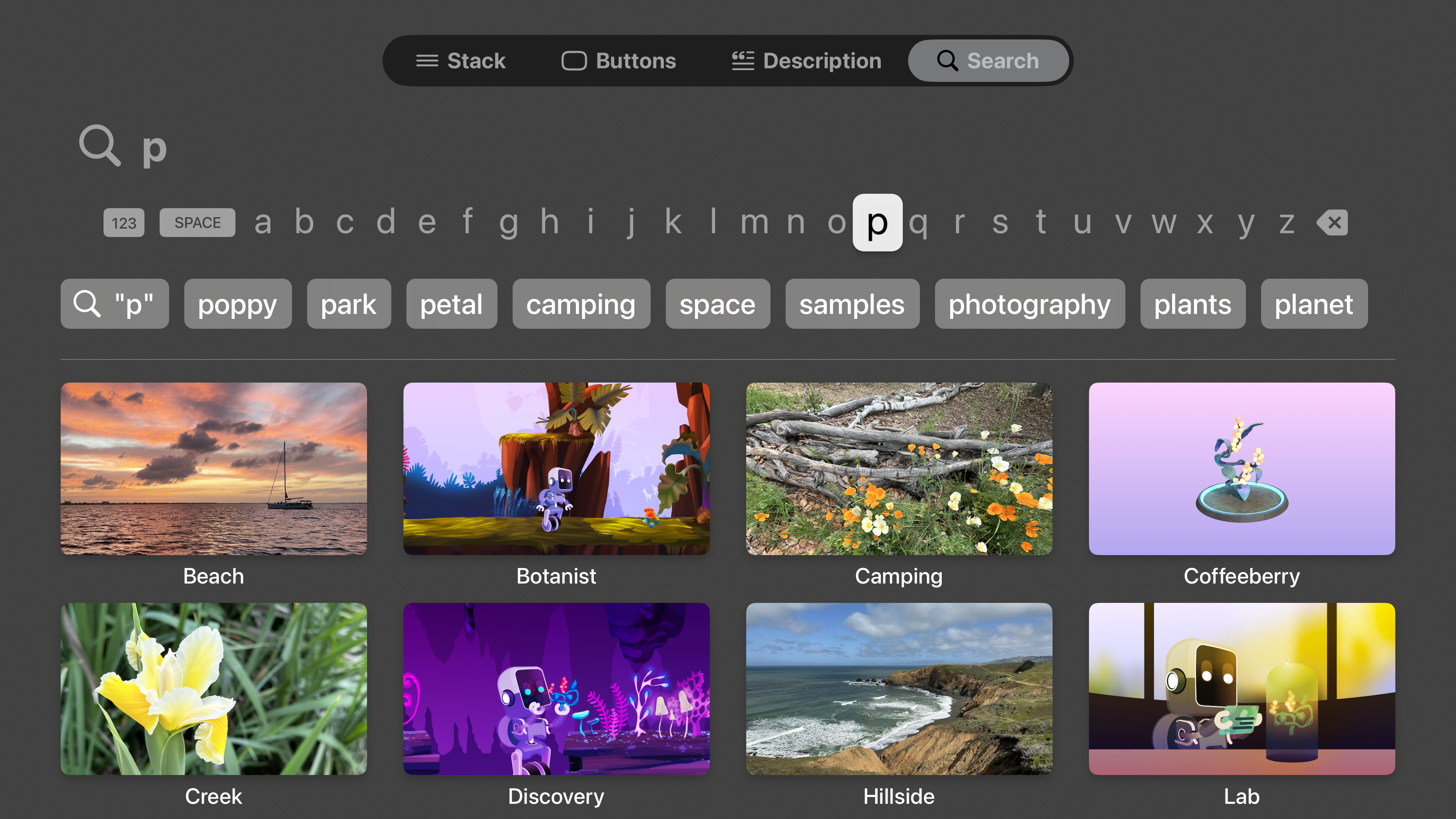
搜索的实现由一些简单的视图修饰符组成,它们在每个 Apple 平台上行为一致。searchable(text:placement:prompt:) 修饰符为你提供整套搜索界面,并把搜索框绑定到所提供的文本上。通过附加 searchSuggestions(_:) 修饰符,你可以呈现一列可能的搜索关键字补全。它们通常是 Text 实例,但 Button 和 Label 也可以。
请务必对搜索结果排序,让网格中的内容稳定且可预测。
 1
 2
 3
 4
 5
 6
 7
 8
 9
10
11
12
13
14
15
16
17
18
19
20
21
22
23
| ScrollView(.vertical) {
LazyVGrid(
columns: Array(repeating: .init(.flexible(), spacing: 40), count: 4),
spacing: 40
) {
ForEach(/* 匹配的素材,已排序 */) { asset in
Button { /* 动作 */ } label: {
asset.landscapeImage
.resizable()
.aspectRatio(16 / 9, contentMode: .fit)
Text(asset.title)
}
}
}
.buttonStyle(.borderless)
}
.scrollClipDisabled()
.searchable(text: $searchTerm)
.searchSuggestions {
ForEach(/* 与搜索词匹配的关键字 */, id: \.self) { suggestion in
Text(suggestion)
}
}
|