8.2.3.1 使用 Kandy 进行数据可视化

原文链接: https://kotlinlang.org/docs/data-analysis-visualization.html

8.2.3.1 使用 Kandy 进行数据可视化

Kotlin 提供了一站式的强大且灵活的数据可视化解决方案,让你在深入复杂模型之前能够以直观的方式呈现和探索数据。

本教程演示如何在 IntelliJ IDEA 中使用 Kandy 和 Kotlin DataFrame 库创建不同类型的图表。

开始之前

注意: 从 IntelliJ IDEA 2026.2 开始,Kotlin Notebook 将不再随 IDE 一起提供,也不再由 JetBrains 官方支持。源代码仍可在 GitHub 上获取。更多信息请参阅博客文章。

要学习本教程:

  1. 选择 File | New | Kotlin Notebook。
  2. 在你的笔记本中导入 Kandy 和 Kotlin DataFrame:
1
2
   %use kandy
   %use dataframe

请在任何其他代码单元之前先运行包含 %use dataframe 这一行的代码单元,以确保 DataFrame 库及其 API 在笔记本中可用。

要学习本教程,你也可以把 DataFrame 用作 Gradle 或 Maven 依赖。

创建 DataFrame

首先,我们创建一个包含待可视化数据的 DataFrame。这个 DataFrame 存储了柏林、马德里和加拉加斯的模拟月平均气温:

 1
 2
 3
 4
 5
 6
 7
 8
 9
10
11
12
13
14
15
16
// months 变量存储一个包含一年 12 个月份的列表
val months = listOf(
    "January", "February",
    "March", "April", "May",
    "June", "July", "August",
    "September", "October", "November",
    "December"
)
// tempBerlin、tempMadrid 和 tempCaracas 变量分别存储一个列表
// 其中包含每个月份的气温值
val tempBerlin =
    listOf(-0.5, 0.0, 4.8, 9.0, 14.3, 17.5, 19.2, 18.9, 14.5, 9.7, 4.7, 1.0)
val tempMadrid =
    listOf(6.3, 7.9, 11.2, 12.9, 16.7, 21.1, 24.7, 24.2, 20.3, 15.4, 9.9, 6.6)
val tempCaracas =
    listOf(27.5, 28.9, 29.6, 30.9, 31.7, 35.1, 33.8, 32.2, 31.3, 29.4, 28.9, 27.6)

现在让我们创建一个新变量(df),并使用 dataFrameOf() 函数生成一个包含三列(Month、Temperature 和 City)的 DataFrame:

1
2
3
4
5
val df = dataFrameOf(
    "Month" to months + months + months,
    "Temperature" to tempBerlin + tempMadrid + tempCaracas,
    "City" to List(12) { "Berlin" } + List(12) { "Madrid" } + List(12) { "Caracas" }
)

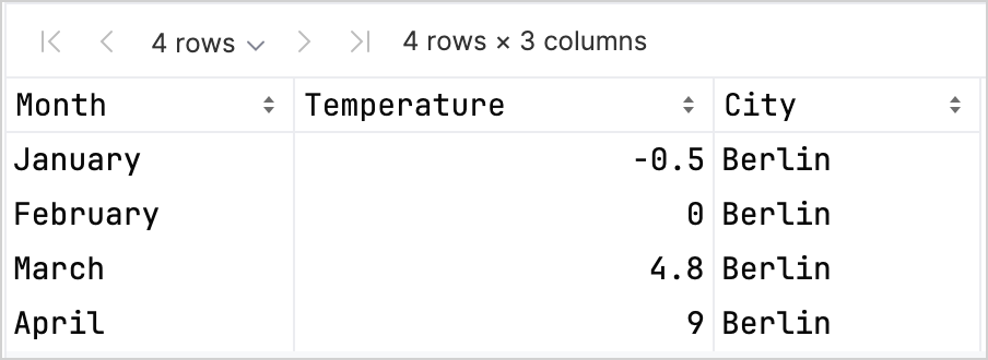
要预览数据,请使用 .head() 函数:

1
df.head(4) // 返回前四行

在我们的数据集中,前四行存储的是柏林 1 月到 4 月的气温:

DataFrame 探索

提示: 访问列记录有多种方式,在把 Kandy 与 Kotlin DataFrame 库一起使用时,它们有助于提高类型安全性。更多信息请参阅访问 API。

创建折线图

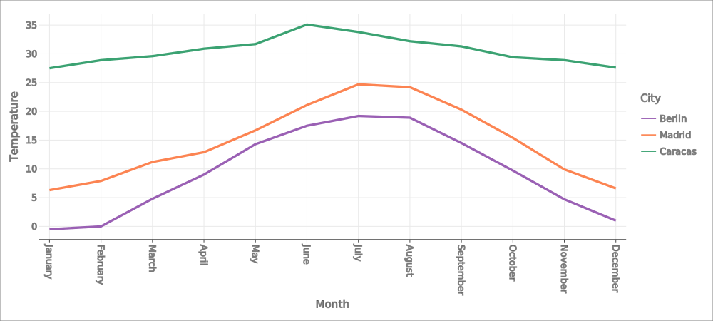
我们使用上一节的 df DataFrame 创建折线图:

  1. 调用 Kandy 库中的 .plot() 函数。
  2. 应用 line() 图层。
  3. 把 Month 和 Temperature 列相应映射到 X 轴和 Y 轴。
  4. (可选)自定义颜色和尺寸。
 1
 2
 3
 4
 5
 6
 7
 8
 9
10
11
12
13
14
15
16
17
18
df.plot {
   line {
      x(Month)
      y(Temperature)

      color(City) {
         scale = categorical(
            "Berlin" to Color.hex("#6F4E37"),
            "Madrid" to Color.hex("#C2D4AB"),
            "Caracas" to Color.hex("#B5651D")
         )
      }
      width = 1.5
   }
   layout {
      size = 1000 to 450
   }
}

结果如下:

折线图

创建散点图

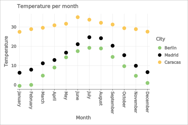
现在,我们用散点图来可视化 df DataFrame:

  1. 调用 Kandy 库中的 .plot() 函数。
  2. 应用 points() 图层。
  3. 把 Month 和 Temperature 列相应映射到 X 轴和 Y 轴。
  4. (可选)自定义颜色、坐标轴标签、点的大小和图表标题。
 1
 2
 3
 4
 5
 6
 7
 8
 9
10
11
12
13
14
15
16
17
18
19
20
21
22
df.plot {
   points {
      x(Month) {
         axis.name = "Month"
      }
      y(Temperature) {
         axis.name = "Temperature"
      }

      color(City) {
         scale = categorical(
            "Berlin" to Color.hex("#6F4E37"),
            "Madrid" to Color.hex("#C2D4AB"),
            "Caracas" to Color.hex("#B5651D")
         )
      }
      size = 5.5
   }
   layout {
      title = "Temperature per month"
   }
}

结果如下:

散点图

创建柱状图

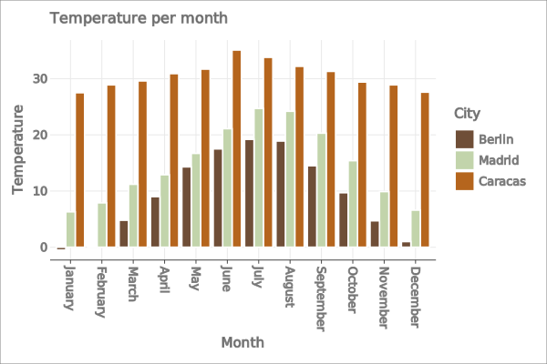
最后,我们为每个城市创建一个柱状图:

  1. 使用 .groupBy() 函数按 City 列对 DataFrame 分组。
  2. 调用 Kandy 库中的 plot() 函数。
  3. 应用 bars() 图层。
  4. (可选)为图表添加标题并自定义颜色。
 1
 2
 3
 4
 5
 6
 7
 8
 9
10
11
12
13
14
15
16
17
df.groupBy { City }.plot {
    bars {
        x(Month)
        y(Temperature)

        fillColor(City) {
            scale = categorical(
                "Berlin" to Color.hex("#6F4E37"),
                "Madrid" to Color.hex("#C2D4AB"),
                "Caracas" to Color.hex("#B5651D")
            )
        }
    }
    layout.title {
       title = "Temperature per month"
    }
}

结果如下:

柱状图

接下来做什么